On Tuesday, I attended the following sessions at the #DLFforum and then visited the Milwaukee Art Museum.


Here are the photos and notes from the day.


 Juxta
Juxta


On Tuesday, I attended the following sessions at the #DLFforum and then visited the Milwaukee Art Museum.
Here are the photos and notes from the day.
Juxta
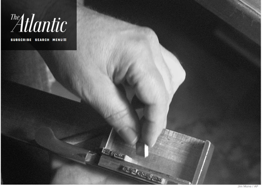
On The Atlantic, Lindsay Lynch writes about typesetting letterpress and the en space in “How I Came to Love the En Space”:
To understand letterpress printing, imagine that every letter you see on your screen is an object, a tiny piece of metal. Not only is every letter an object, but every space between every letter is also an object. Every space between words, every space between lines—every bit of white space is an object. When typesetting, a printer has to think about negative space as something tangible.
This is where the en space comes in. An en space is a rectangular piece of metal or wood whose primary purpose is to be smaller than the metal or wood type being printed. The en space isn’t type-high—it doesn’t sit proud like an ordinary character—so it doesn’t catch ink when it’s run through the press. It just holds printable type together in a tight grid, creating spaces between words. It is never seen, but without it, everything printed would be nonsense.

I’m scanning again this afternoon. I’m on my second series of broadsides from the Literary House Press at Washington College. In the scanner now is a broadside of a poem by Eduardo C. Corral, designed by Jehanne Dubrow and printed by Mike Kaylor in 2013.
Yesterday afternoon, I began digitizing broadsides from my own collection and from loans from Washington College’s Literary House Press. Here’s a sneak peek of the first scan.


To me the book of poetry provides the best vehicle for interpretive typography by the artist-printer. A well-executed book of poems has an artistic merit as an object beyond the literary merit of the poetry itself.
—Clifford Burke, pg. 3 of Printing Poetry: A Workbook in Typographic Reification (Scarab Press, 1980)
Note: I will use this text in later research annotations, and, as it’s a letterpress edition about printing poetry using letterpress, the text will hopefully appear in the Book Object series on this blog as well.
