“Writing produces a visual image: the shapes, sizes and placement of letters on a page contribute to the message produced, creating statements which cannot be rendered in spoken language”
—Johanna Drucker
Title: “Letterpress Language: Typography as a Medium for the Visual Representation of Language”
Author(s): Johanna Drucker
Journal/Publisher: Leonardo 17.1
Year: 1984
Pages: 8–16
Source: JStor
Notes: Johanna Drucker discusses three of her book art works—26 ’76, from A to Z, and Against Fiction—that used letterpress toward various goals. Of particular interest are her discussions of the function of the letter as a unit of meaning and the process by which she composed from A to Z, that is, the composition of the text through typesetting rather than the setting of already written text. Drucker also suggests that the “conservative constant” in her work is that her language make meaning. Is a poetry broadside’s function not to make meaning? Is this ultimately a conservative endeavor? These are questions I have now as I approach the act of contextualizing and curating the broadsides in OFFSET.
Introduction
Consider: “The relation between the formal, visual aspects of typography and the production of meaning in a printed text”
“Writing produces a visual image: the shapes, sizes and placement of letters on a page contribute to the message produced, creating statements which cannot be rendered in spoken language.”
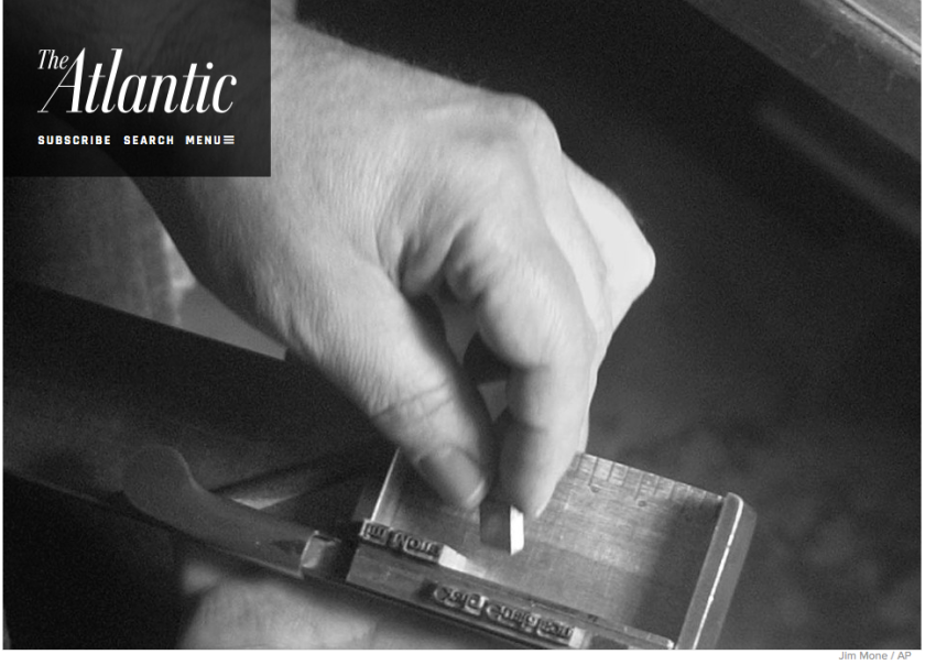
“Handsetting type quickly brings into focus the physical, tangible aspects of language—the size and weight of the letters in a literal sense—emphasizing the material specificity of the printing medium”
“The single conservative constant of my work is that I always intend for the language to have meaning.”
“setting type also emphasizes the importance of the letter as the basic unit of written forms”
26 ’76: The Structure of the Page
“visual structures actually produce meaning”
from A to Z: A Text Generated from the Contents of a Typecase
“[the book] is…about literary accessibility, about the levels of literary organizations, ranging from clear to opaque, permitting a reading from the most obvious level—the sequence of poems—to the most involved and difficult level”
“Lastly, the book is about letters, about their role in the manufacture of writing as linguistic expressions…Letters in their own right are capable of carrying discrete and simultaneous messages. Despite their ‘ordinary’ purpose, which is to compose the very words that generally overwhelm or negate their individual presence, letters possess a V!V!D ability to create”


