Poem
Quote: “If words were material…”
Extracurricular Reading, QuotesDora Malech on Broadsides, on The Kenyon Review’s Blog
Extracurricular Reading, Research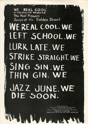
“We Real Cool, Broadside no. 6,” poem by Gwendolyn Brooks and printed by Broadside Press, source: Broadside Press Collection at University of Massachusetts Amherst
Last year, Dora Malech wrote “Different (Broad)sides,” a brief exploration into the history of the broadside and Broadside Press, over on The Kenyon Review‘s blog. She discussed contemporary broadside aesthetics as well:
“In exploring contemporary broadside and chapbook culture, one notices two streams–printed works that maintain a populist spirit and DIY sensibility, and printed works that exhibit a “fine arts” aesthetic through limited-edition letterpress artistry and heightened attention to design and material elements. This is, of course, a false “high/low” dichotomy; these streams overlap and intertwine.”
Malech links to the following sources, digital archives, bibliographies, and more:
- University of California’s English Broadside Ballad Archive
- Central Michigan University’s Detroit’s Broadside Press Bibliography
- The University of Michigan’s Broadside Press Records
- University of Massachusetts Amherst’s Broadside Press Collection
- University of Detroit Mercy’s Dudley Randall Broadside Press Collection
- The Knight Foundation’s blog post “A rich library of African-American poetry goes digital”
- Broadside Lotus Press
- University of Iowa’s Center for the Book
- Prairie Lights Bookstore
- Dolphin Press & Print at the Maryland Institute College for Art
Many thanks to Dora for providing me with some quick links for further research and for cultivating a conversation about broadsides.
Research: The Shape of Poetry: A Typographic Exploration of Poetry and Synesthesia (2015) by Boliang Chen
Research“the transmission history of poetry depends upon visual forms”
— Boliang Chen
Title: The Shape of Poetry: A Typographic Exploration of Poetry and Synesthesia
Author(s): Boliang Chen
Journal/Publisher: a thesis submitted in partial fulfillment of the degree of Master of Fine Arts at Rochester Institute of Technology’s School of Design
Year: 2015
Pages: N/A
Source: ProQuest
Notes: Design MFA candidate Boliang Chen explores the relationship between the typographic presentation of poetry and synesthesia in order to see how graphic designers might produce emotional reactions to poetry. Through research and practical application, Chen hypothesizes that a synesthetic typographical design could make poetry, like Shakespeare’s Sonnets, more accessible to contemporary readers. This thesis might provide a good foundation for making a case that poetry broadsides, through their design and tactility, offer readers a different experience of a poem than a book, literary magazine, or online publication. I might ask myself whether or not the poetry broadside, particularly those with a high appeal to the physical experience (paper texture, letterpress embossing, etc.), appeals more to a synesthetic experience of the poem than other reading formats. I very much enjoyed reading through this thesis, and I find that the ideas here are really fascinating, even if I feel that some of its leanings toward visual poetry might detract from the experience of the craft of the language. Questions I still have as I walk away from this reading are:
- How might some of these design elements be distracting for some readers? Could some of this typographic design be heavy handed?
- Does the use of highly stylized typographic design draw the text more toward graphic art rather than poetic art? Is there a difference? Should we make this disntinction?
- Can synesthesia be triggered outside of the typographic elements? (My thought is yes, it can be and is.) How does typographically triggered synesthesia really enhance the poem? Does it provide a soundtrack equivalent to what the poet intended to be orchestrated, or is it like playing new music over an old film? Should the poet’s intention be the graphic designer’s goal?
These are all productive conversations to have with myself, and I appreciate Chen’s help in engineering this line of inquiry for my project. I’ve included some screenshots from the thesis, but otherwise this thesis is available through ProQuest databases.
pg. 5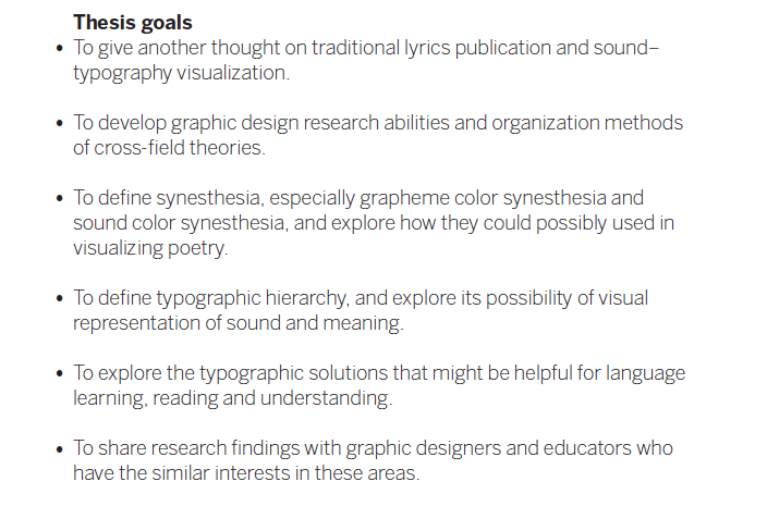
pg. 7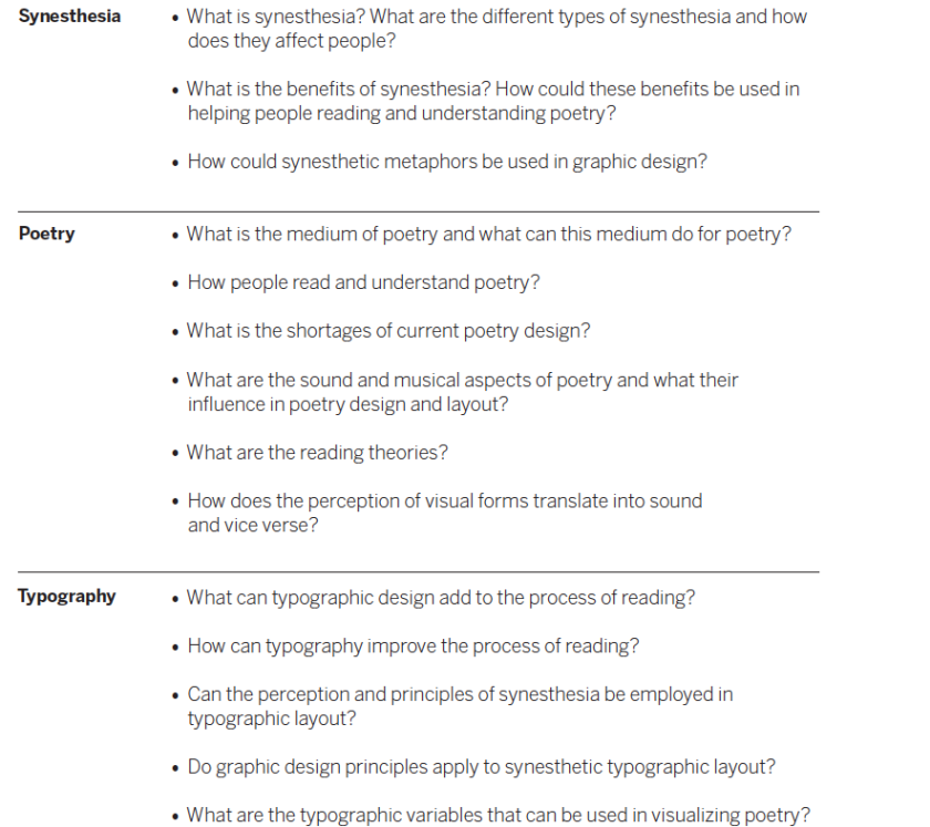
pg. 16
“One study indicates that synesthesia is seven times as common in creative people as in the general population.”
“‘And your very flesh shall be a great poem.’— Walt Whitman”
pg. 17
pg. 19
“The origins of poetry may well reside in sound and song. But the transmission history of poetry depends upon visual forms.”
pg. 21
“Orientation is…[a] graphic code that does not derive from or lend itself to vocal rendering. But vocal analogy maps onto the visualization does not simply impose an arbitrary relation of sound to sight.”
pg. 22
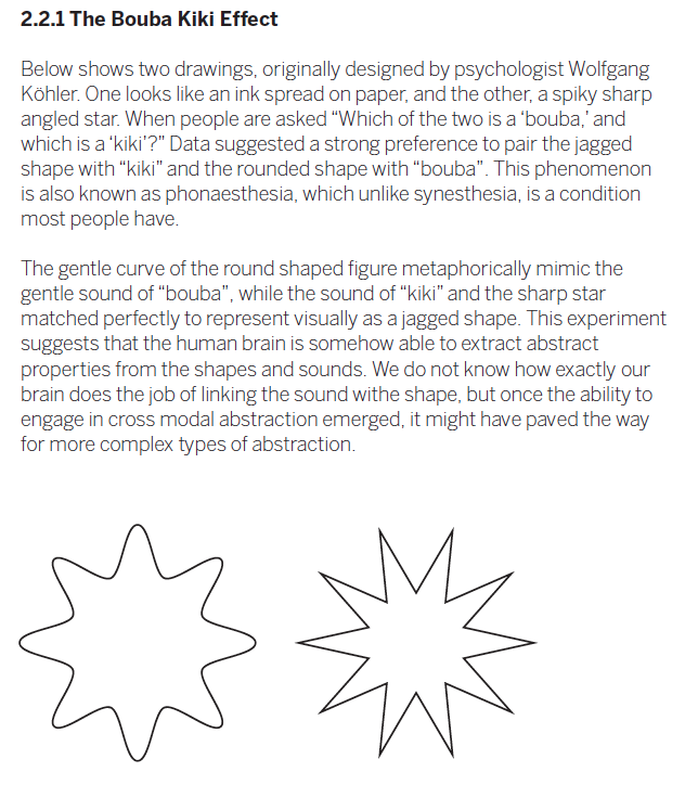
Three reading models: word shape, the serial letter recognition model, and the parallel letter recognition model
*
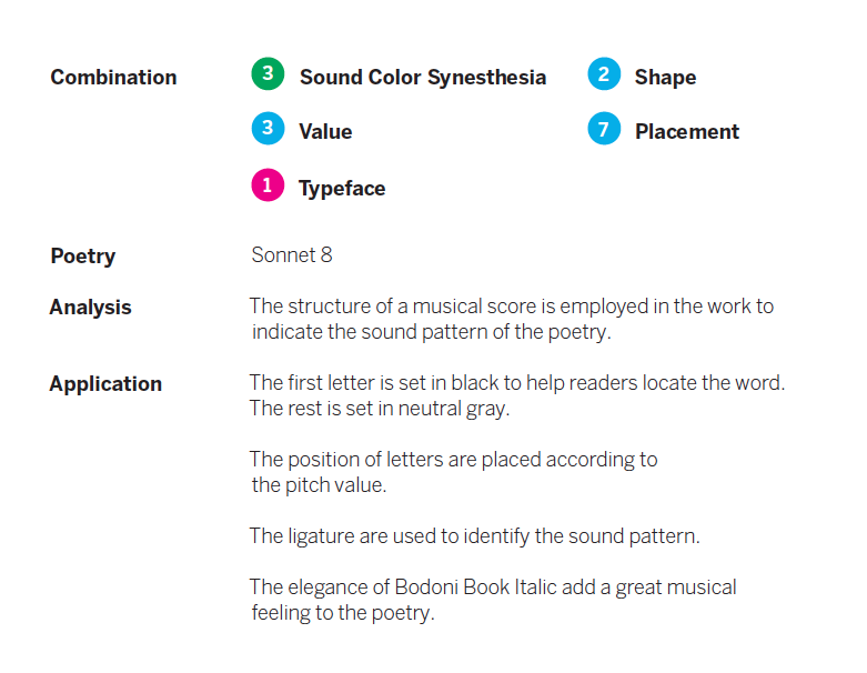
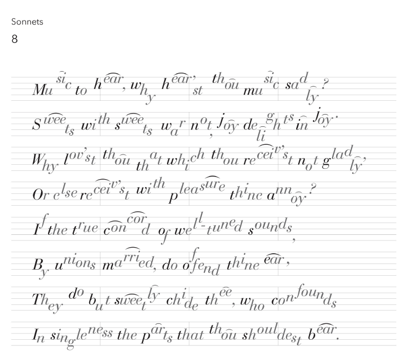
Chen then goes on to demonstrate his research into synesthetic experiences and typographic practices through several examples. He sets Shakespeare’s Sonnets in various ways. One example appears below.
pg. 33–34
Scanning Today
Objects, Offset, Project NarrativeI’m scanning again this afternoon. I’m on my second series of broadsides from the Literary House Press at Washington College. In the scanner now is a broadside of a poem by Eduardo C. Corral, designed by Jehanne Dubrow and printed by Mike Kaylor in 2013.
Research: Lewis & Clark’s Digitized Poetry Broadside Collections
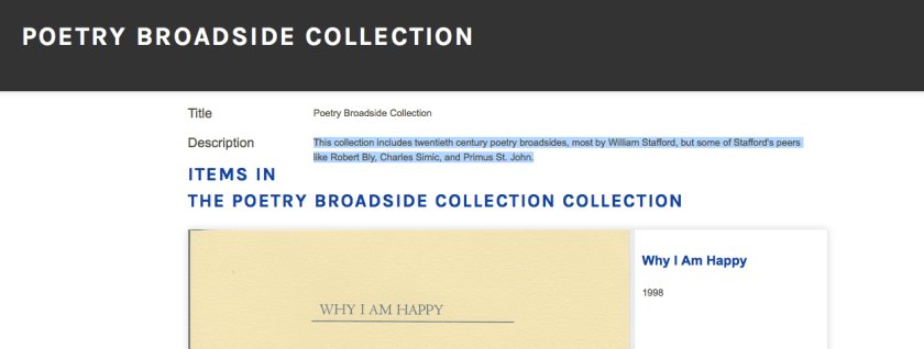
Objects, ResearchThis morning I found the Poetry Broadside Collections in the Lewis & Clark Digital Collections. These digitized broadsides include “twentieth century poetry broadsides, most by William Stafford, but some of Stafford’s peers like Robert Bly, Charles Simic, and Primus St. John.” This digital collection provides me with a precedent for my own digitization project, as I have yet to find another poetry broadside collection available online. This collection displays all the broadsides on a single page with only the name of the poem and, when available, the date it was published. There’s no information about the printers, publishers, or the occasion for printing. My hope is to include that information on my digitized broadsides as well as display them in a gallery format. The Lewis & Clark scans often maintain the edges of the broadsides, something I feel is important, as those edges give one a sense of depth, size, and texture of the paper. This is a great little digital collection with some wonderful examples of broadsides with text and illustrations.
First Scan for Offset
Objects, Offset, Project NarrativeQuote: “the margins will…flood the text”
Quotesin the end, the margins will rise / over their banks / and flood the text
—Tomas Tranströmer, “The Gallery” (trans. Patty Crane) from Bright Scythe (Sarabande Books)
Quote: poetry and technology go “digit in digit”
Quotes, UncategorizedFor this quote, I’ll refer you to an interview I did with Don Share, editor of Poetry, back in 2014 as a part of the 32 Poems Prose Feature, of which I was editor.
Emilia Phillips: Does poetry lend itself to new media and innovative textuality more than other genres? If so, how?
Don Share: I don’t know about more, but poetry certainly can do that. We’ve got apps and a website and podcasts and digital publishing projects at the magazine and at the Poetry Foundation, so every day I see ways in which poetry and new media connect with each other. If you want to know why poetry isn’t dead, part of the reason is that it keeps happening. And so does the development of technology. They go hand in hand. Or maybe digit in digit! But there’s also a way in which poetry is rather conservative – in both the bad and good senses of the world. However it comes to you, a poem is a poem.
—from “No End to What Can Be Imagined: An Interview with Don Share”


